Why nobody is reading your content
We live in a constant state of information overload. There’s just not enough time to consume all the content. So we try to be selective - to find the content that really is valuable to our specific situation. Yet the presentation of the majority of content out there seems to ignore this irrefutable fact.
A gray wall of text kills user experience
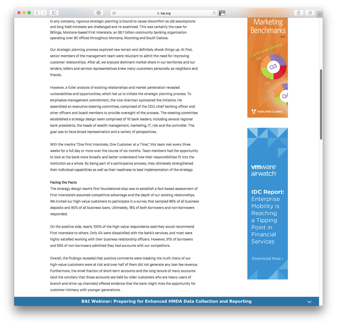
Case in point is this post on BAI.org - a banking strategy blog. Now I readily admit that it’s kind of financial-services-geeky to be reading this stuff. But it irritates me that money is so friggin’ complicated when it doesn’t have to be. And I’m on a bit of a crusade to simplify it - so I read this stuff. When I came across this post, it illustrated what I keep preaching.
The presentation of your content is as important as the quality of the writing.
This particular post gave me a wall of gray text. When a subhead did break up the monolith of words, it was nondescript. Not great for SEO. And not great for the user experience.

This was on a laptop. When I simulated what it looked like on a mobile device, it got worse.
Too damn daunting?
The author of this post may be the most brilliant writer on the planet. This missive may be full of incredibly valuable insight and masterfully written so as to carry the reader effortlessly along. The only problem is that it looks too damn daunting to read.
Understand the 3 stages of content engagement
Potential readers will engage with your content in 3 stages. You need to understand this if you want to have a chance of imparting your expertise to them.
- The initial impression - they are looking at your headline (is it intriguing and relevant?) They’re looking at the initial visual. They’re not scrolling yet. They’re quickly assessing whether they should spend any more time with this content – this is decided in just seconds. This is not a license to create a bunch of sensational crap. Because if you trick them into getting to stage 2 or stage 3, they will not only refuse to read your content, they will also be pissed off that you tricked them.
- The scan - your initial headline and visual intrigued them. Now they will scan. They will scroll, looking at subheads, pull quotes, captions, and bullets. They want to make sure this post is worth the read. That means that the subheads need to be enticing and everything seems consistent and relevant so this doesn’t seem like a scam to get them to read.
- The read - once they are convinced this content is worth their time, they’ll read. But that does not guarantee that they will finish or even get to your most salient point. Your content needs to be structured in a way that makes it easy and fun to digest.
Tips for defeating the gray monolith of text syndrome
Think about what you would want to experience as a reader. Here are a few tips for making that post irresistible.
- Write short sentences - they are easier to read. And it forces you to sharpen your writing.
- Use short paragraphs - it encourages the reader to continue. They see the next short paragraph and think, “I can get through that.”
- Craft compelling subheads - they can tease at insight and pull people through the piece.
- Format with bullets (or numbers) - it helps in both the scan and read stages.
- Insert pull quotes - they are eye catching and can highlight your best insight.
- Illustrate - use pictures and graphics. Just make sure they are relevant to what you’re saying - otherwise, they end up being distracting eye-candy.

If you want a good example of how to execute this, go check out just about any post over at Fast Company.
If you’ve made it this far, I’ve been successful following my own advice. Now go out and create that great content - incredibly insightful stuff that’s incredibly easy to consume.