A quick illustration for improving user experience
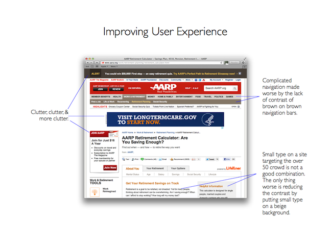
There is no better way to illustrate how to improve user experience than to breakdown a page. I recently ran across the AARP's retirement calculator page as I was doing research for my posts at financialmarketingnews.com. AARP.org is a site targeted at the 50+ crowd - a group that is quickly adopting the technology but is less willing to spend time with a site with a complicated user experience.
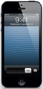
The AARP site has some work to do. The navigation is complicated. And the brown on brown navigation bars add to the complexity. The site could benefit from a reduction in clutter. Mostly, I was surprised by the small type size and lack of contrast of the type on a site built for folks who have a high likelihood of needing reading glasses. This is especially surprising in a time when designers have shown us how big type and prominent buttons can be beautiful (see the iPhone example).
Taking a look at the AARP site reminds me how we need to be vigilant when it comes to our user experiences. Now excuse me, I need to go reevaluate the experiences on the sites I'm working with.